
TL;DR

Get cleaning gear delivered free with Prime
- Fast, free delivery on millions of items
- Prime Video, Amazon Music and more included
- Member-only deals all year
A House Beautiful report lists six kitchen paint colors that interior designers say may be difficult to live with: cool gray, black, bright yellow, stark white, red and lime green. Their concerns include cold-looking rooms, visible cooking residue and finishes that can feel visually overwhelming; these are professional opinions, not universal rules.
House Beautiful has reported that six interior designers advise caution with cool gray, black, bright yellow, stark white, red and lime green in kitchens. Their concerns range from black cabinetry showing cooking residue to highly saturated colors feeling overwhelming, offering homeowners considerations before committing to a paint choice.
The designers’ warnings are based on their professional preferences and experiences, rather than a formal study or a claim that these colors always fail. Shannon Kadwell, kitchen and bath director at Anthony Wilder Design Build, says cool gray can make a kitchen feel cold and sterile instead of warm and inviting. Kelly Neely, founder of Kelly Neely Interiors, similarly cautions that stark white may feel cold, despite white kitchens’ classic appeal.
Practical upkeep is one concern with black cabinetry. Sharon L. Sherman of Thyme & Place Design says dust can stick to cooking oils that settle on cabinets, while drawers may get dinged as people handle heavy pots and pans. She also says black can be difficult to touch up, and suggests a softly distressed finish for clients who want a dark look.
Other cautions focus on intensity. Darla Bankston May of Bankston May Associates says bright yellow can work as a small accent but may become loud when overused. Marissa Stokes advises against highly saturated yellow or red, favoring softer or muted tones. Libby Baker of Baker Design Co. says lime green could feel jarring and overstimulating at mealtimes. The report does not say homeowners must avoid these shades in every kitchen.
Paint Choices Affect Daily Kitchen Use
Kitchen paint is a visible, long-term choice in a room used for meal preparation and gathering. The designers’ comments point to two practical questions for homeowners: how a color affects the room’s atmosphere, and how a finish may look after everyday cooking and wear. Those factors can matter as much as whether a color is currently fashionable.
The advice also distinguishes between using a shade throughout a room and adding it in smaller amounts. Bankston May says bright yellow may work as an accent even if it becomes overpowering when widely applied. That leaves room for homeowners to use bold colors selectively rather than treating the list as a fixed set of bans.
As an affiliate, we earn on qualifying purchases.
Six Shades Behind the Advice
The House Beautiful article gathers comments from designers about colors they think homeowners may regret in a kitchen. It names cool gray, black, bright yellow, stark white, red and lime green, but the reasons differ by shade. Gray and stark white are described as potentially cold; black is associated with visible residue and touch-up challenges; and strong yellow, red and lime green are associated with visual intensity.
The source frames the kitchen as a place where people cook and gather, so its designers evaluate paint partly by how welcoming and comfortable the room feels. Their views are individual design judgments. The report does not compare paint samples, provide survey results, or establish how frequently homeowners regret these colors.
“A kitchen is meant to be the warm, welcoming heart of the home where people actually want to gather—not a sterile commercial office or a hospital corridor.”
— Shannon Kadwell, kitchen and bath director at Anthony Wilder Design Build
No Universal Color Rules
The report does not establish that the six colors are objectively unsuitable, or that homeowners who choose them will regret the decision. The recommendations reflect individual designers’ opinions; responses to color can vary with the room, lighting, cabinetry, finishes and personal taste. The article also does not give test results or data on maintenance costs, resale value or homeowner satisfaction.
It is also not clear from the supplied source material when the article was published. Its advice should be read as design guidance, not as a guarantee about how a particular shade will look in every kitchen.
Test Colors Before Committing
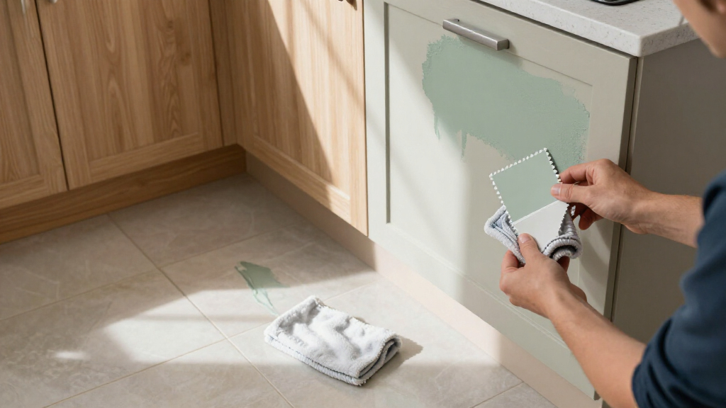
The source does not announce a follow-up study or a formal next step. For homeowners considering a repaint, the practical next move is to compare samples in the actual kitchen and observe them under the room’s different lighting conditions. Those tests can help reveal whether a shade feels too cold or intense before it covers a large area.
Anyone weighing black cabinetry can also consider Sherman’s maintenance concerns and whether a distressed finish better suits the intended look. Ultimately, the designers’ list offers questions to weigh—not a definitive verdict—before making a lasting change.
Key Questions
Which six kitchen paint colors do the designers caution against?
The report names cool gray, black, bright yellow, stark white, red and lime green. The designers’ reasons vary, and their advice is not a universal rule.
Why does one designer caution against black kitchen cabinets?
Sharon L. Sherman says dust and cooking residue may be visible on black cabinetry, drawers can get dinged, and touch-ups may be difficult. She suggests a softly distressed finish as one option for people who want a dark look.
Are bright colors always a bad choice for kitchens?
No. Darla Bankston May says bright yellow can work in small amounts as an accent, though she finds extensive use may feel overwhelming. The article presents opinions, not a rule that all bold colors should be avoided.
Does the report prove these colors cause homeowners to regret painting?
No. It summarizes designers’ judgments and does not provide survey data, testing or evidence that homeowners who choose these colors will regret them.
Source: rss
Halloween Picks
halloween
As an affiliate, we earn on qualifying purchases.